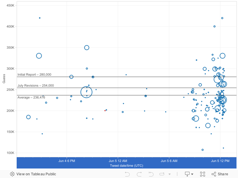
Payroll employment rises by 280,000 in May; unemployment rate essentially unchanged (5.5%) http://t.co/1Y9cSWJUIB #JobsReport #BLSdata
— BLS-Labor Statistics (@BLS_gov) June 5, 2015
Swing and a miss! But this time it's a surprise in the opposite direction - I was 80,000 jobs too short.Here's what the distribution of guesses looked like for this month's go-around:
One thing I've noticed is the remarkable consistency of the average guess. I've plotted out all of the rounds of #NFPGuesses from February to today, and notice how average has come out at around 225,000 each time.
May
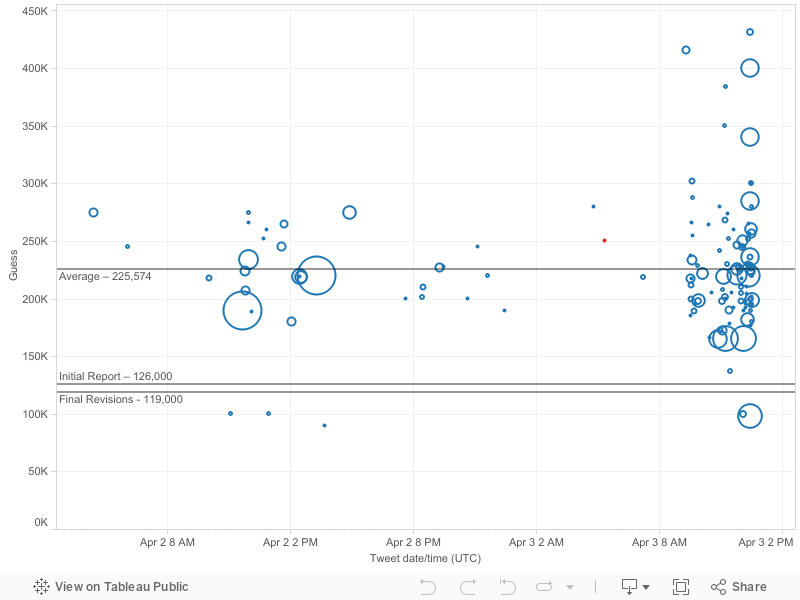
April
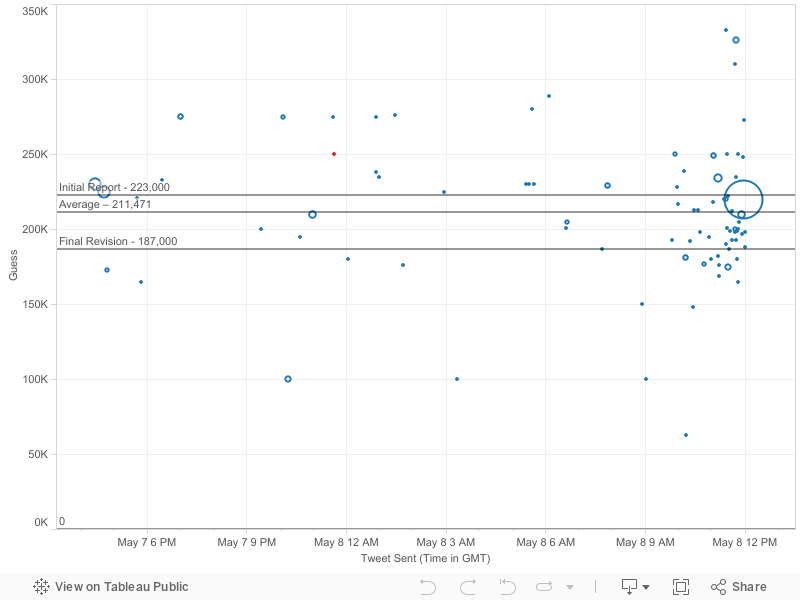
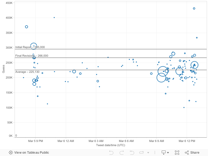
March
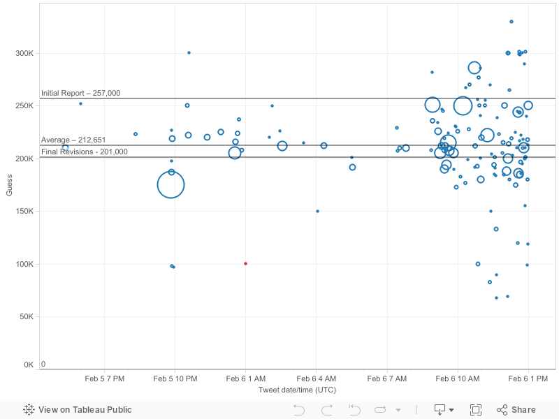
February
As you can see, the average of guesses has been remarkably consistent, even when the actual numbers are not:
It looks like the median twitter armchair economist is consistent, and consistently optimistic. In an average month, an average twitter user will guess +222K, which is higher than the actual jobs figure of 205,400.
There might be a few reasons why this might be the case:

It looks like the median twitter armchair economist is consistent, and consistently optimistic. In an average month, an average twitter user will guess +222K, which is higher than the actual jobs figure of 205,400.
There might be a few reasons why this might be the case:
- This mid-winter dip coincides with severe weather in the Northeast, especially New England. It comes after a huge employment boom in autumn. So it is entirely possible, given a steady recovery and surprisingly disastrous conditions in a region, that tweeters would overestimate job growth.

- Other job data appears to be strong, which means that NFP data might be underwhelming, relative to expectations. For example, JOLTS data (the Job Openings and Labor Turnover Survey), has been quite encouraging over the period I looked at. Companies are looking for employees harder than they have been in the past seven years.
- Finally, this may simply be a manifestation of optimism bias, the tendency of people to predict good events to happen more frequently than reality, and bad ones less frequently. Finance, for example, has a natural incentive to be optimistic, given that good economic conditions prevail most of the time, and crises and recessions in fits and starts.
I want to keep my blog fresh, but I might have another post or 2 with insights I've gathered from looking at this particular trend. So stay tuned!
Until next time.